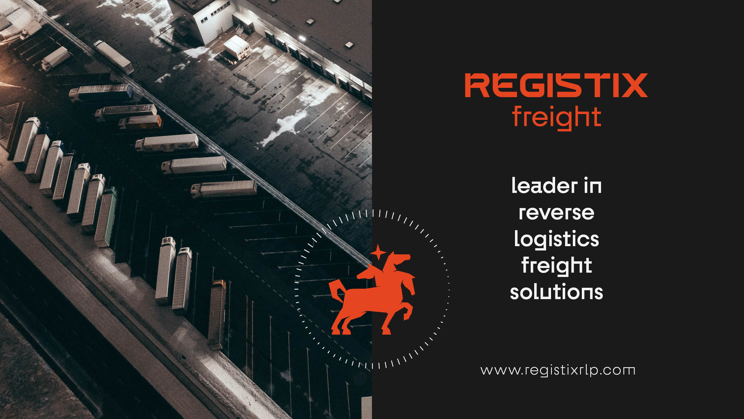
Registix Freight // US
Registix Freight is an American company that offers logistics and freight services globally.
Despite being a young company, it has the potential to achieve an impressive annual revenue of up to 60 million dollars. As a B2B business, Registix Freight seeks a trustworthy brand that effectively communicates its innovative solutions to its clients.
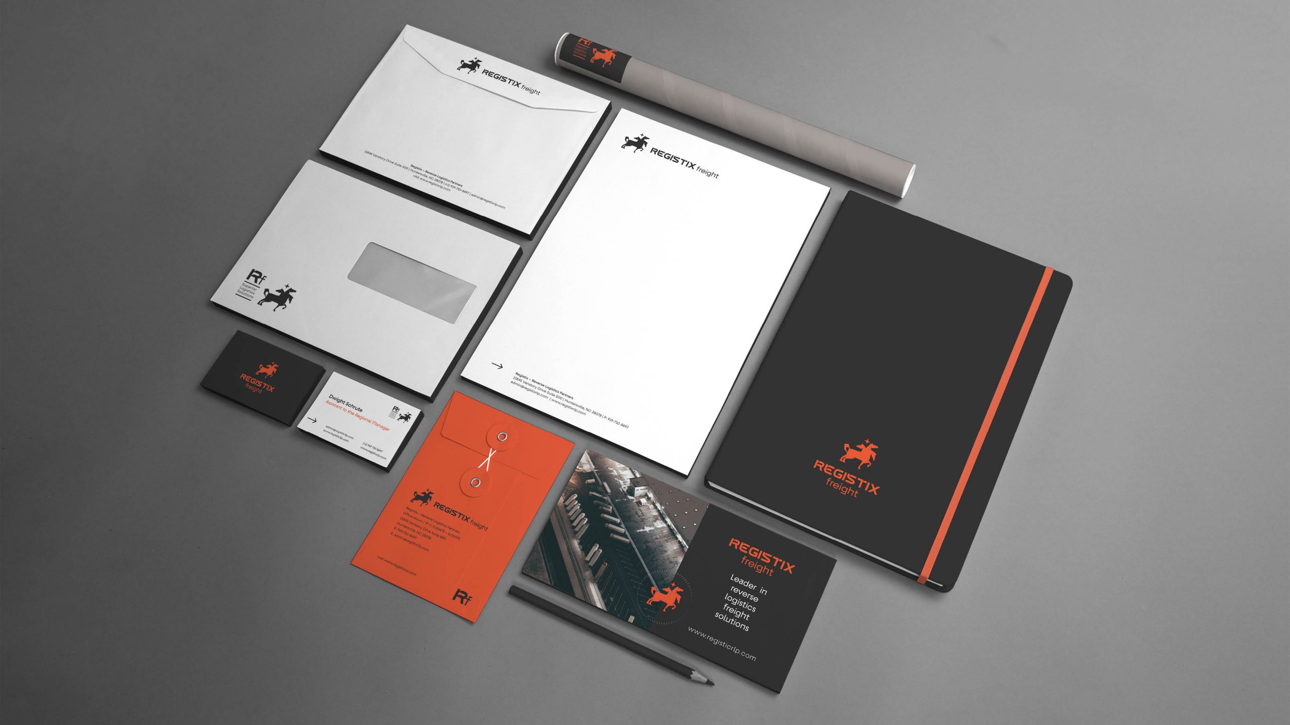
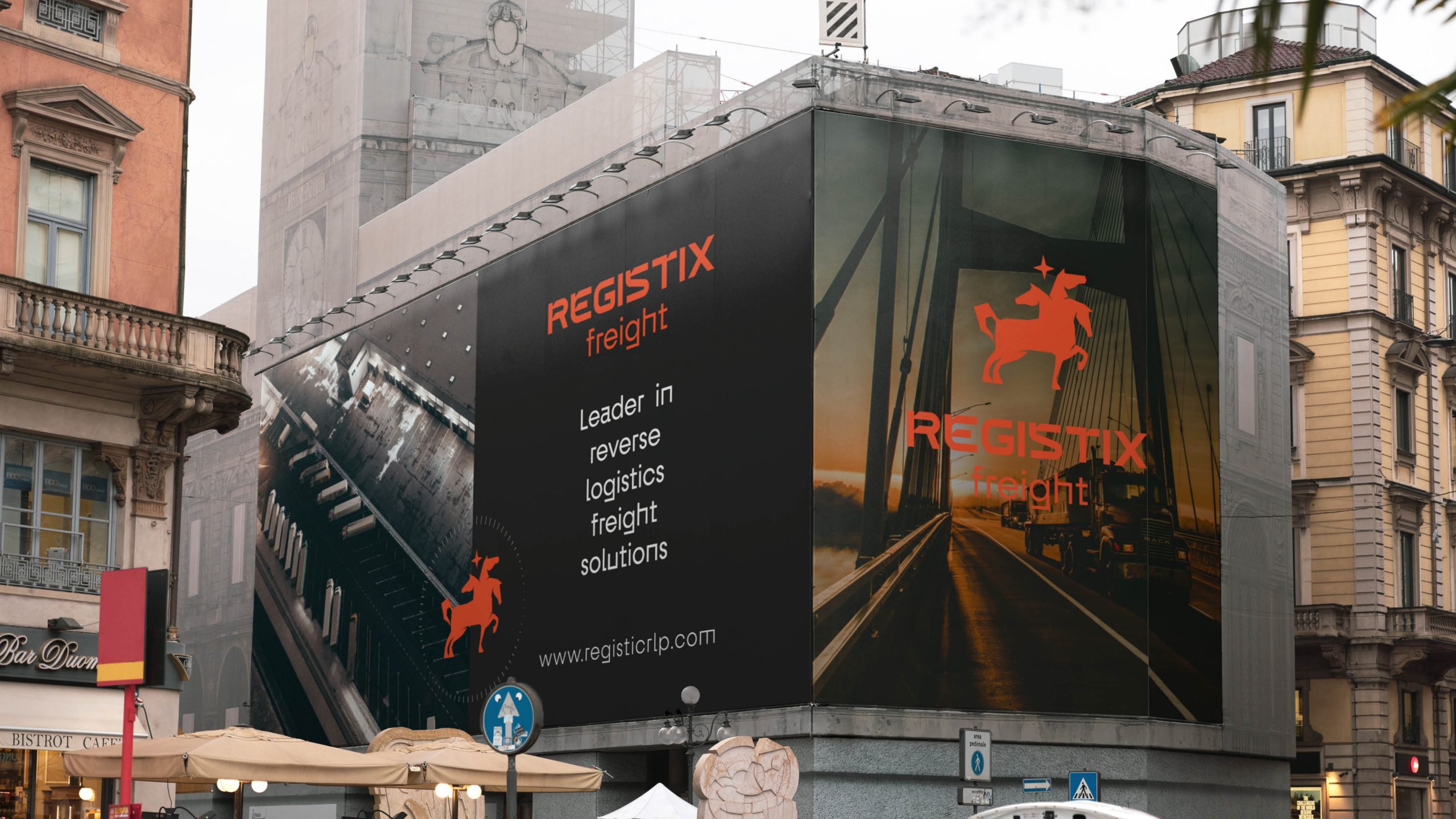
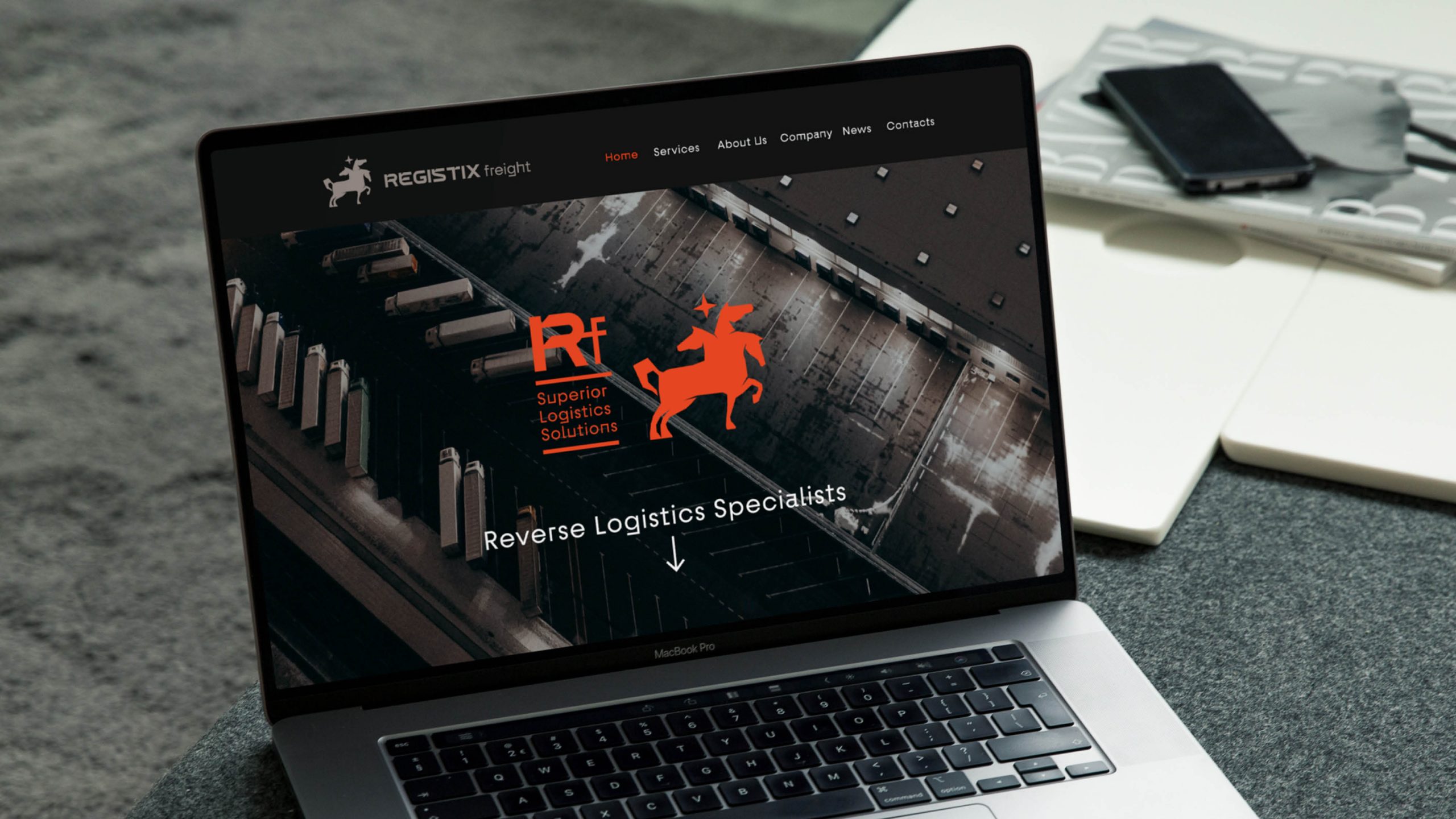
Registix Freight aims to present a solid, reliable, and confident visual identity that conveys its dedication, reliability, honesty, and resourcefulness. The brand should exhibit an elegant and polished appearance, showcasing the company’s organized approach to tailoring solutions based on its clients’ needs.
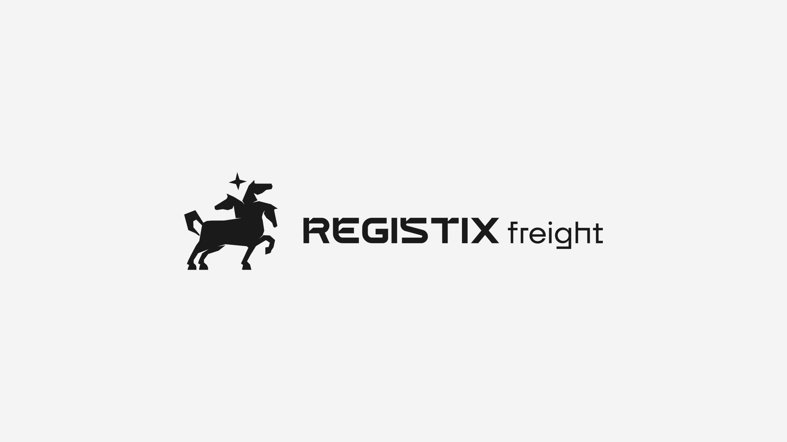
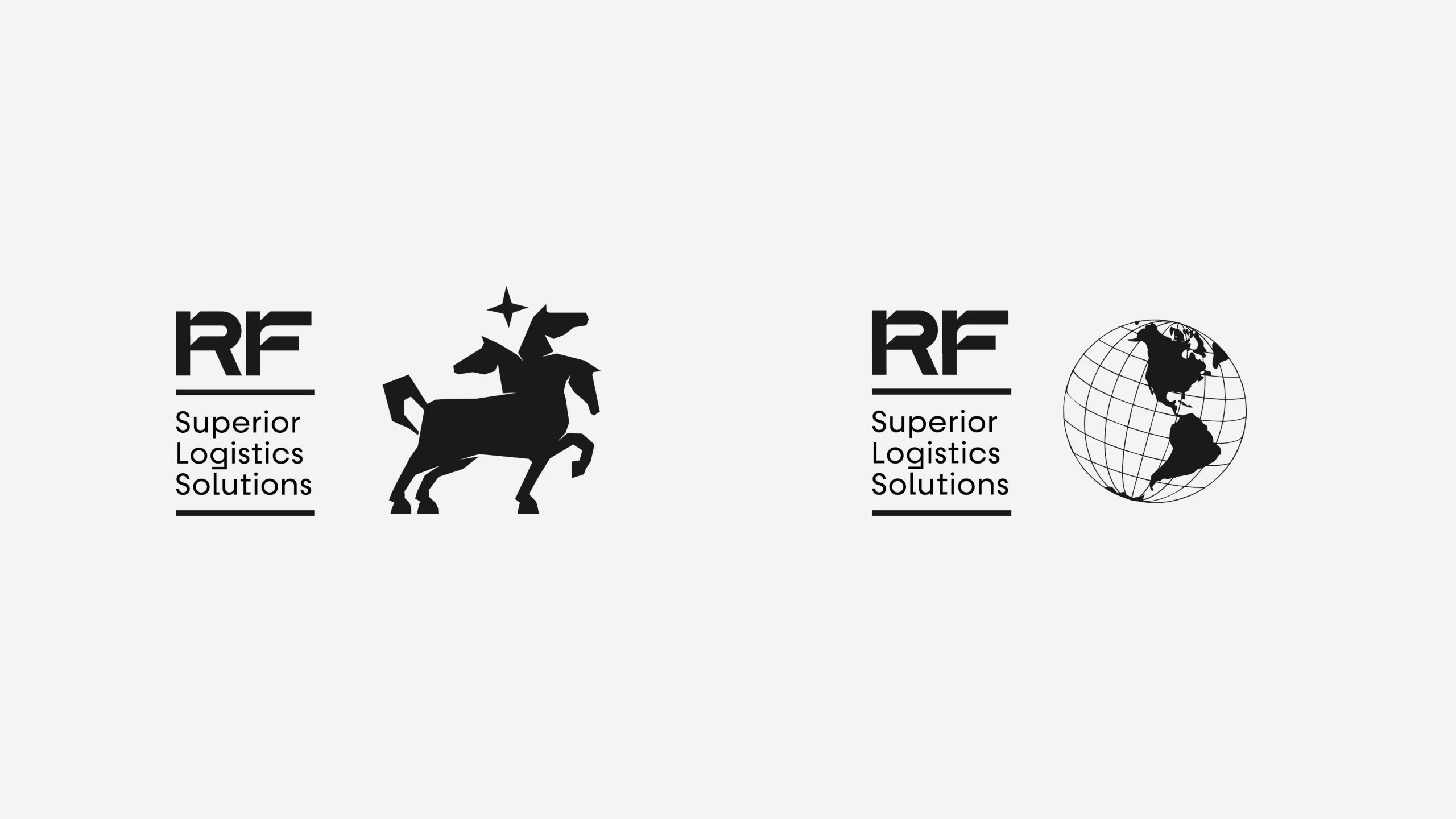
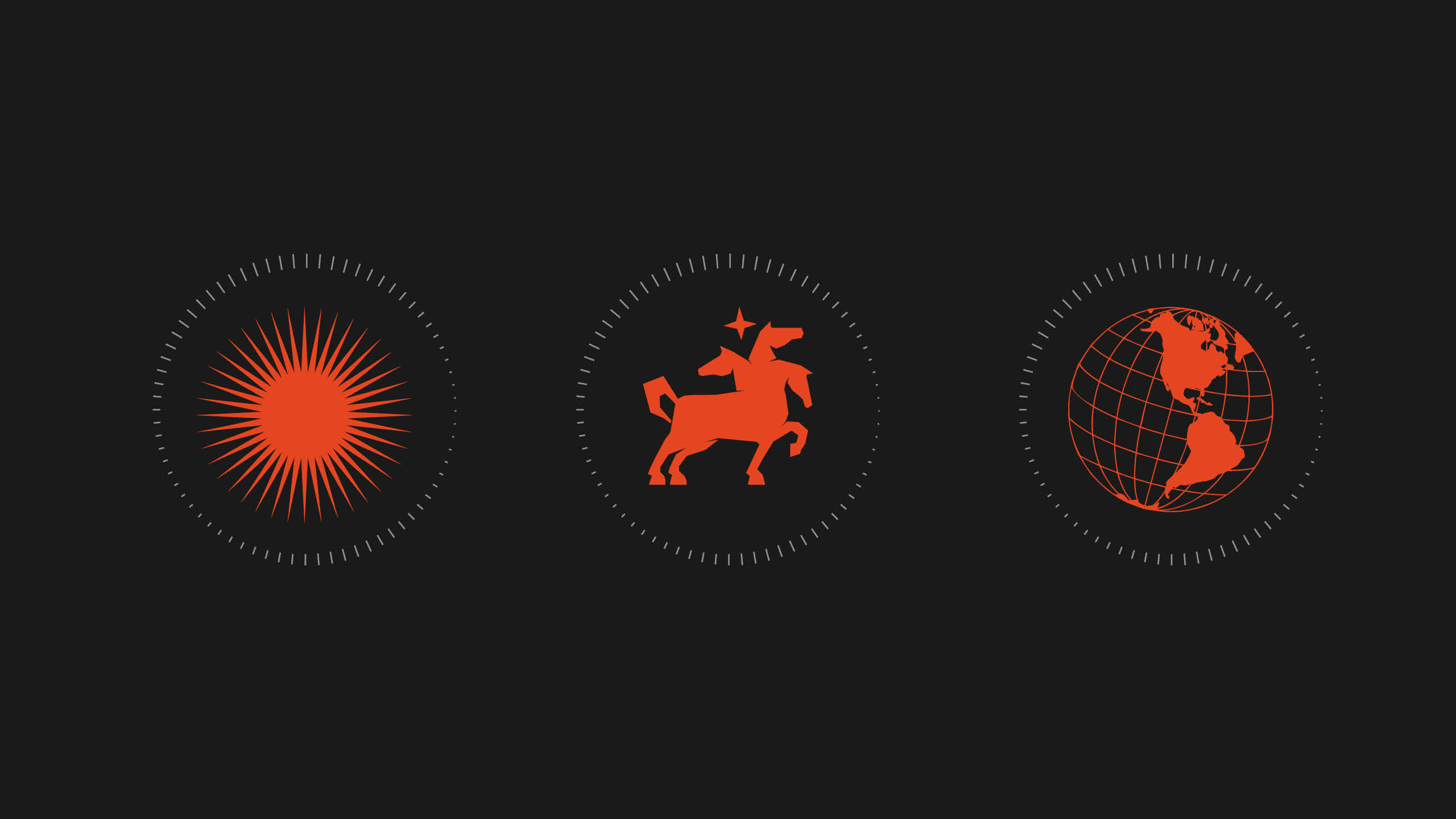
Clients seeking a reliable partner to entrust their concerns will be drawn to the powerful visuals of a brand that appears solid, consistent, and corporate-with-a-soul. With this purpose in mind, I have chosen the Horse Archetype as a symbol of strength and sacrifice.
Horses are a symbol of controlled power, sacrifice, and dedication.
They carried humans into wars and through expansive conquests, including the Wild West. However, given the overuse of horse symbols in various industries, I have created a unique mythical creature: a three-headed horse symbolizing Dedication, Accountability, and Sacrifice—three of the many qualities embodied by Registix Freight.