Star Power Exhibits // US
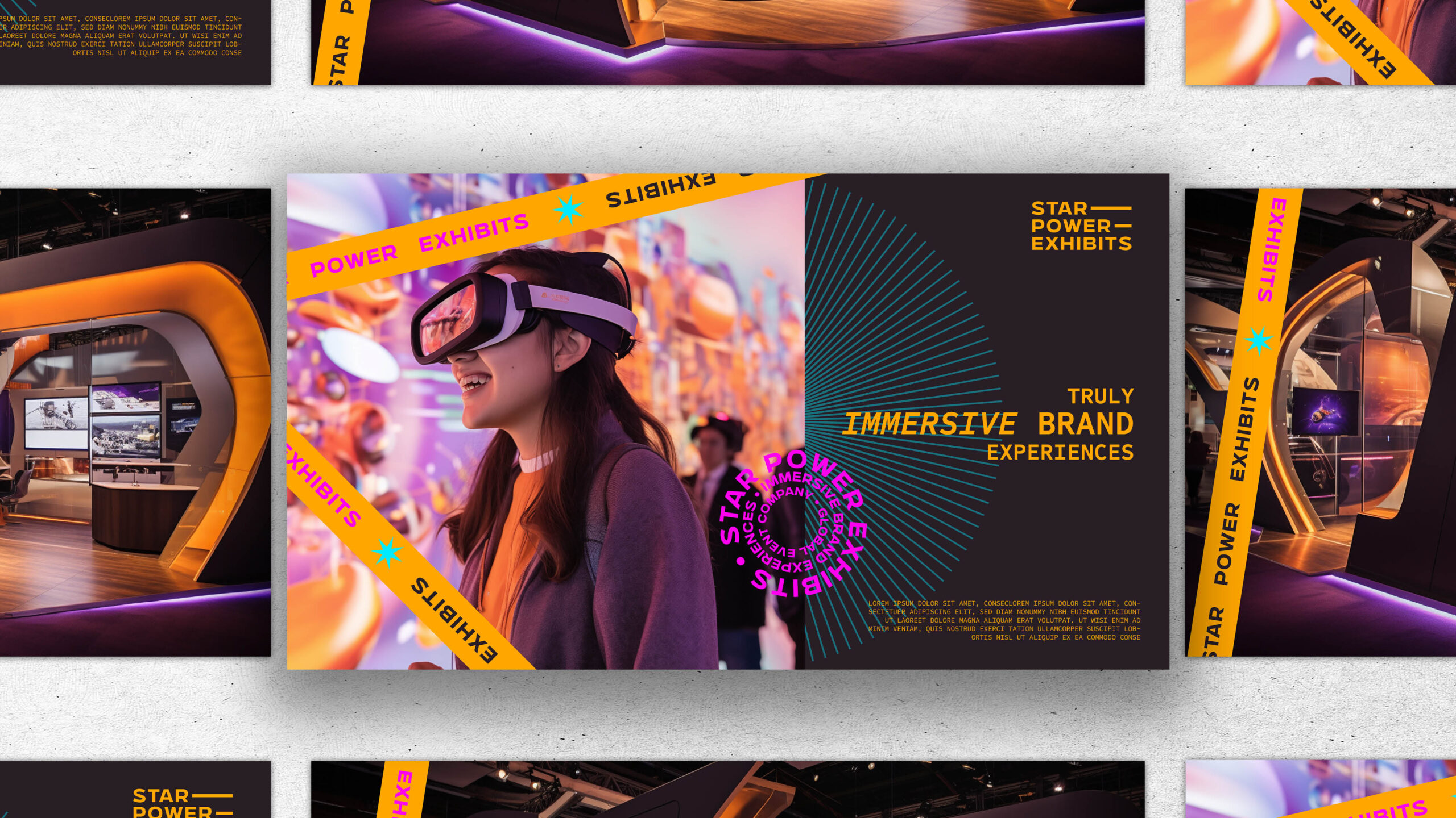
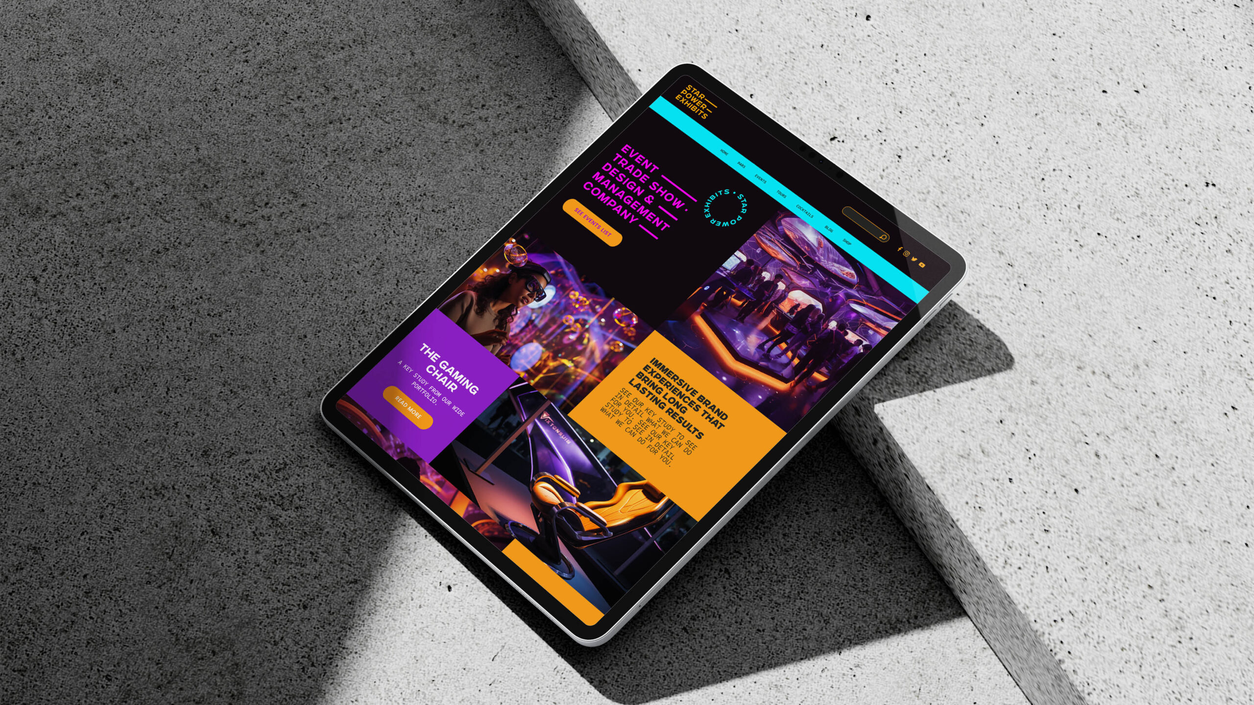
Star Power Exhibits stands at the intersection of professional insight and approachable partnership in the trade show industry. Their depth of knowledge in booth design and gaming culture positions them as a beacon of information and innovation. Simultaneously, their friendly, mentor-like approach fosters a sense of trust and ease, making every collaboration not just a business transaction, but a journey undertaken with a knowledgeable ally.
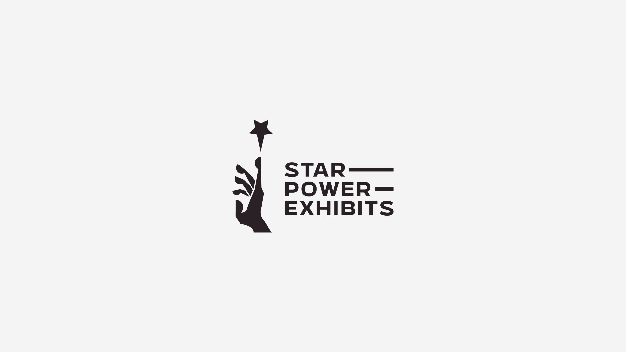
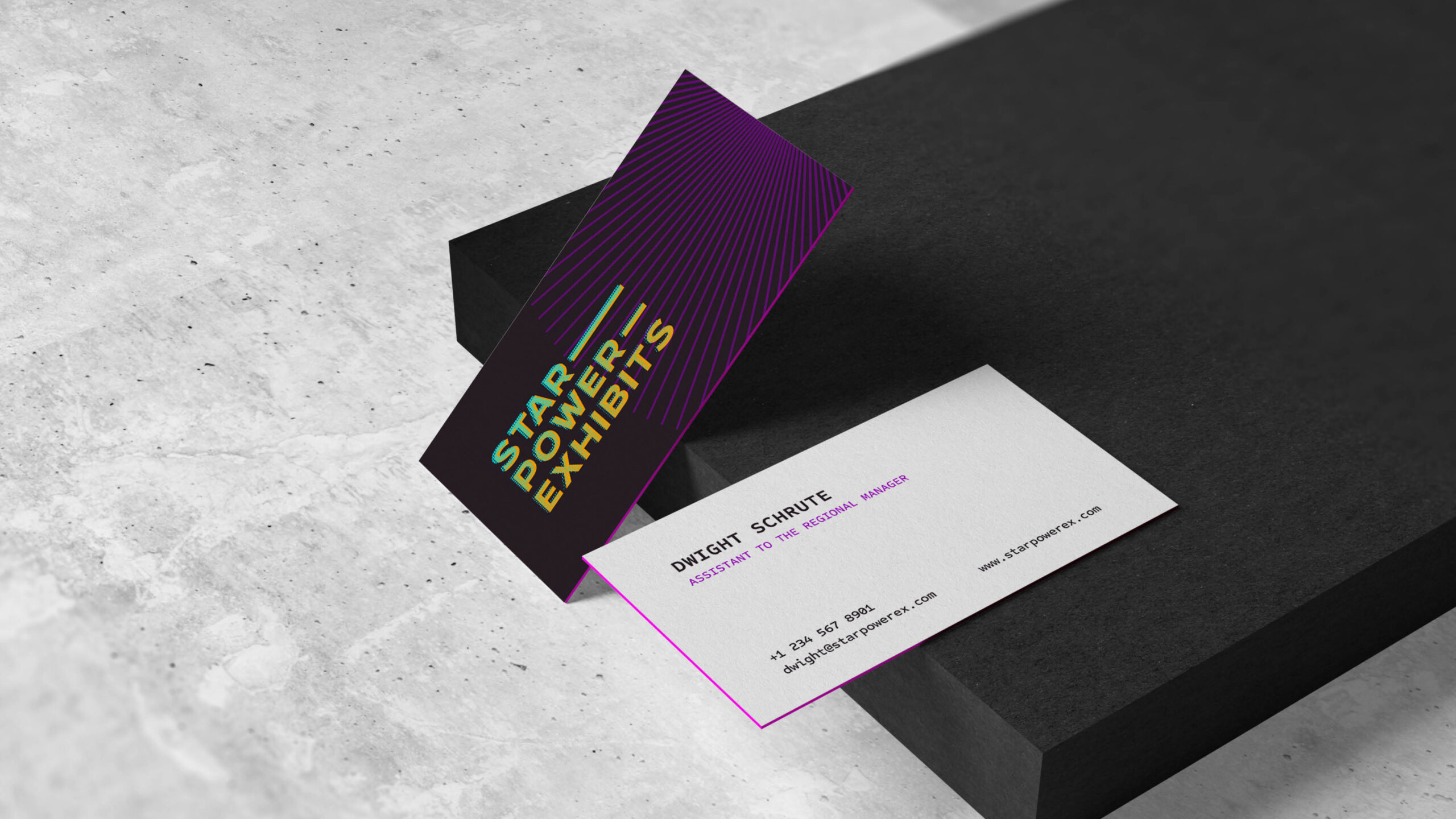
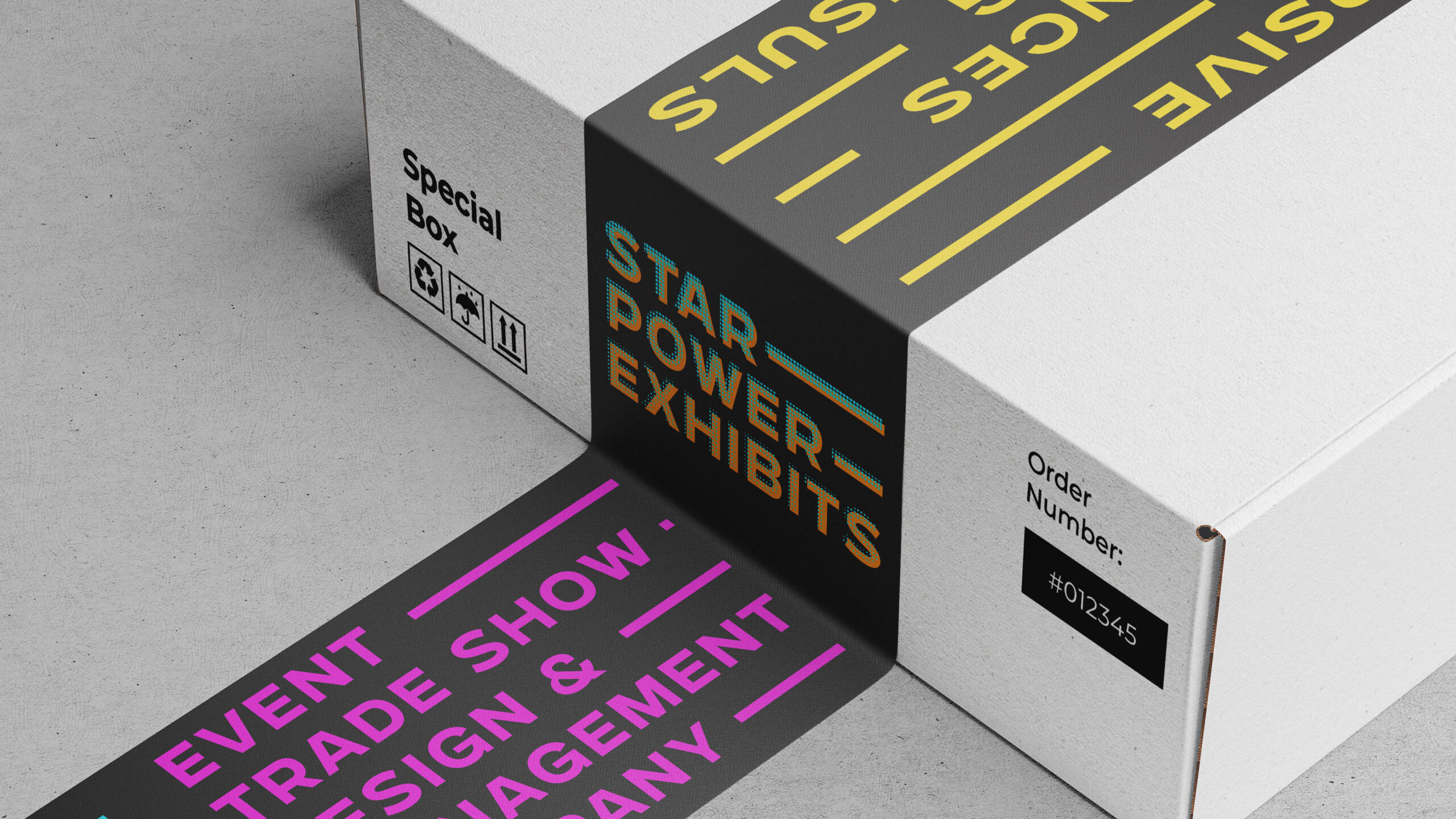
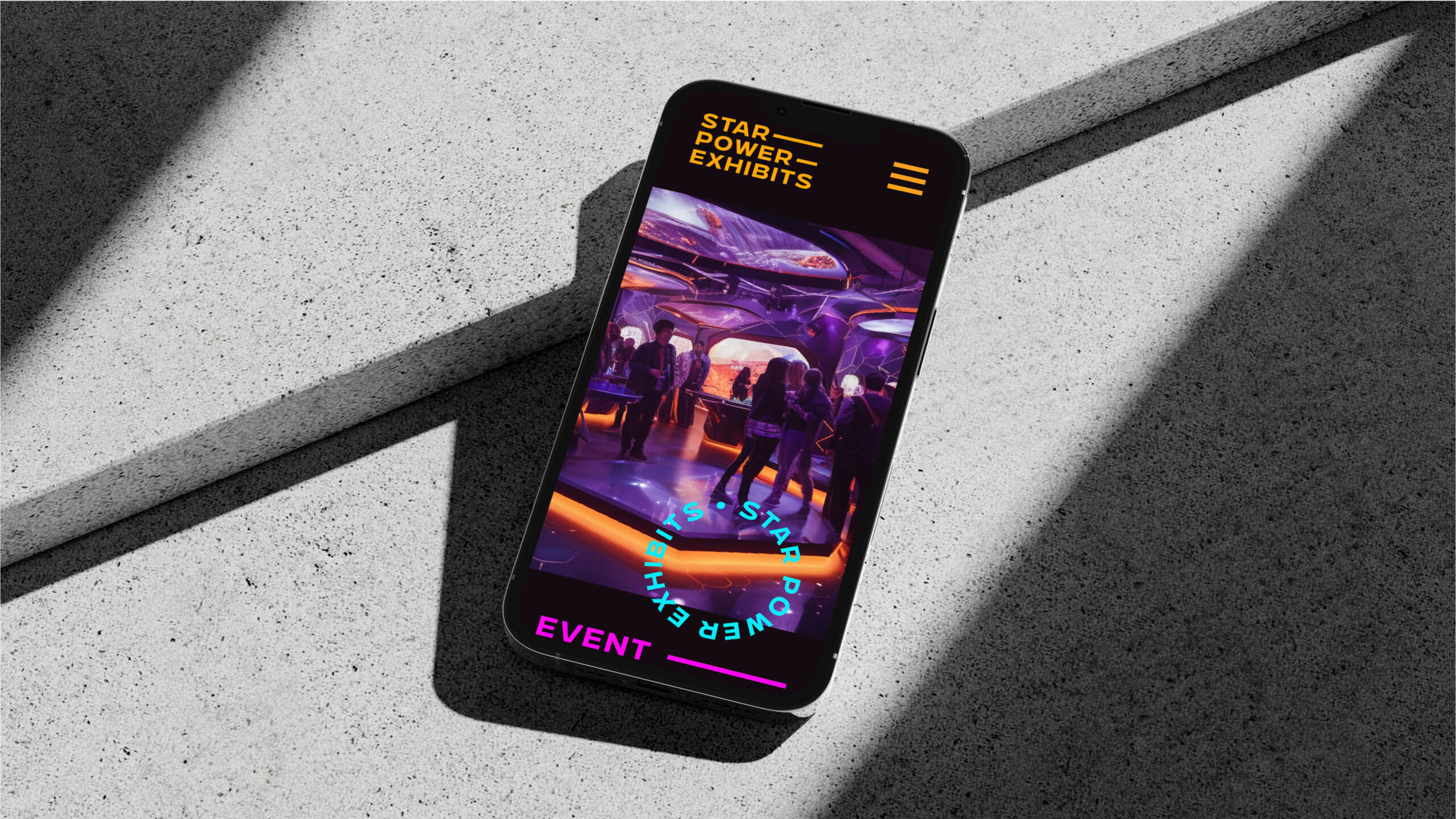
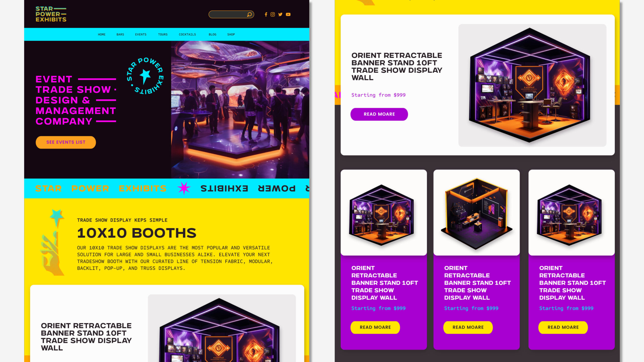
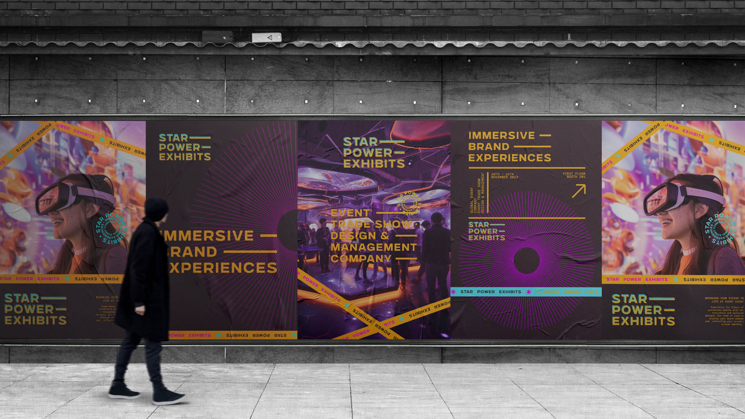
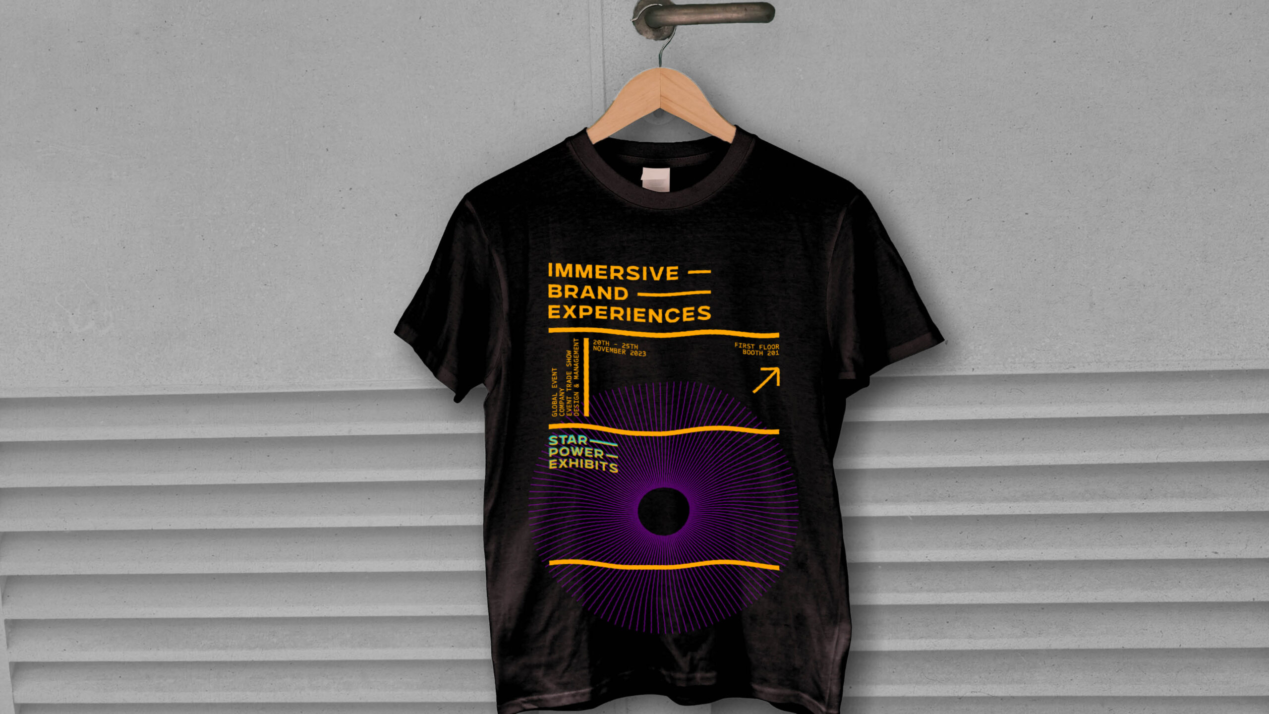
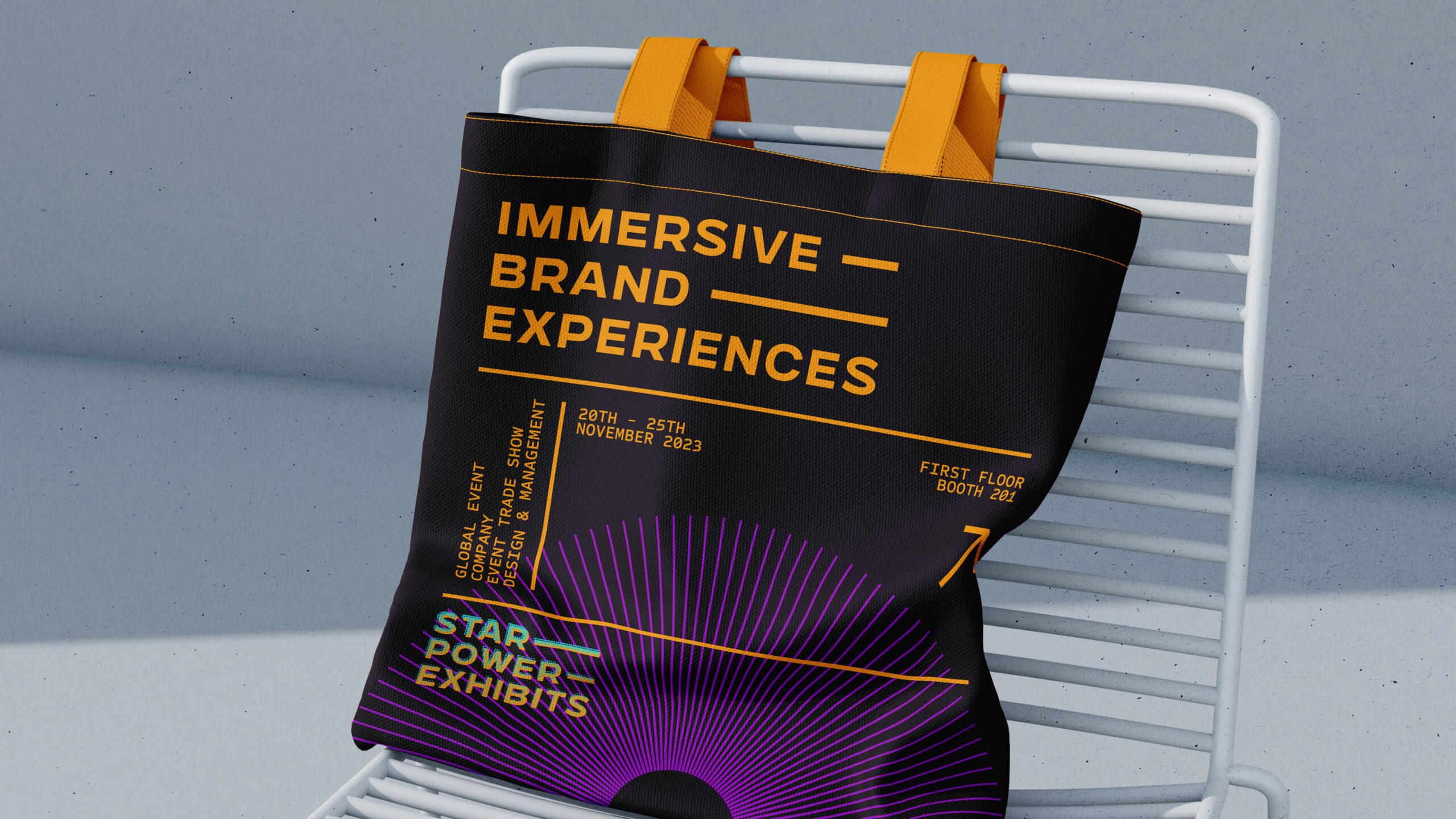
The iconic mark features a hand with a star radiating from the pointing finger, symbolizing the inner power and enchanting capabilities of the company. Complementing this creative imagery, the use of a bold and clear typeface reinforces the icon’s strong and confident message. The use of an extended version of the Chaney typeface conveys a sense of minimalistic seriousness, firmly rooting the brand in a professional sphere. A vibrant neon palette injects a dynamic and playful spirit into the brand, resulting in a striking and solid visual identity.