Hello Baby // Rebranding // UK
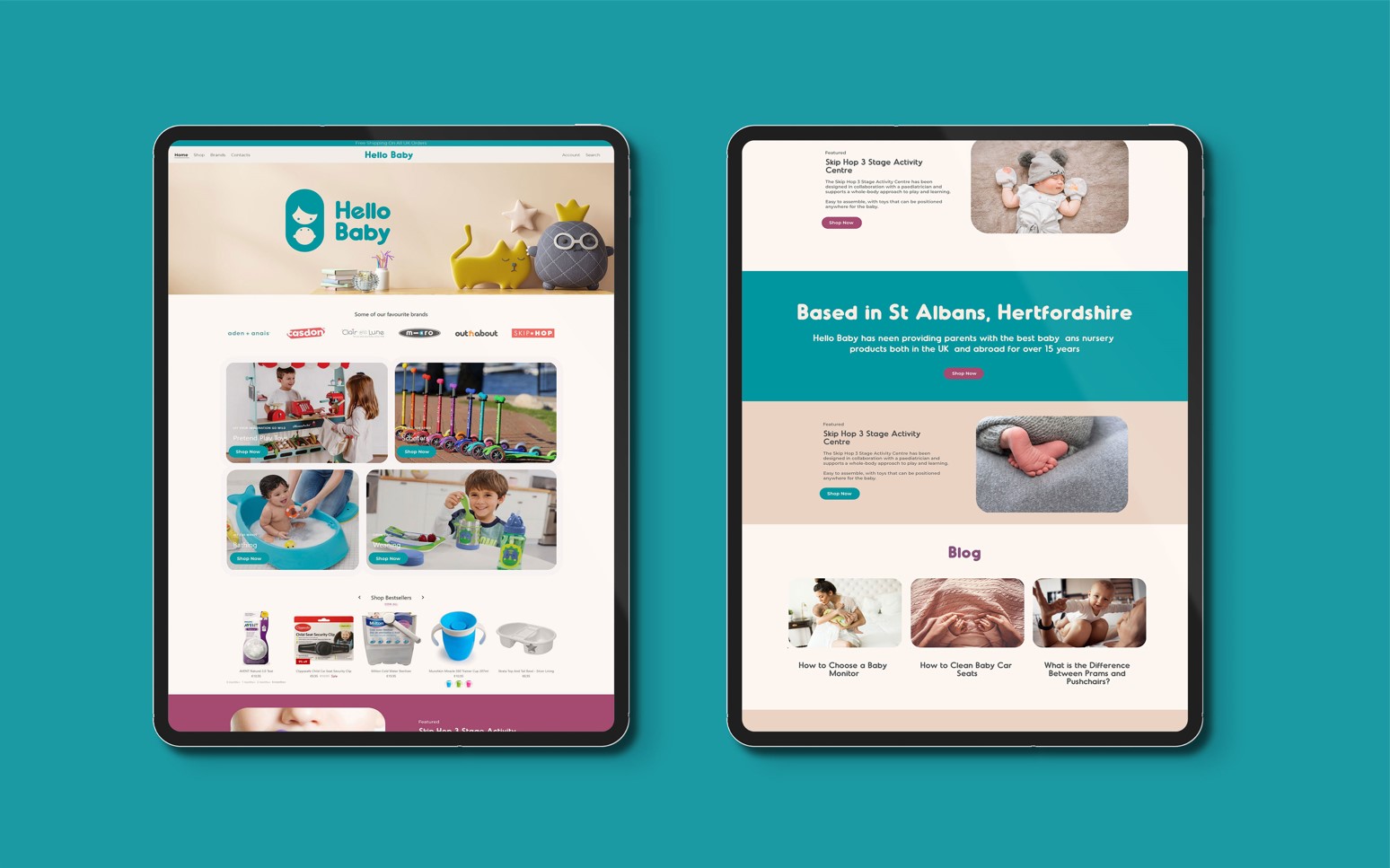
Hello Baby is a 12-year-old e-commerce company specializing in products for children aged 0-5.
The client approached me to rebrand their company and initiate a process that would strengthen their identity and help them reach a larger customer base. The goal was to create a trustworthy brand that demonstrates an understanding of its client’s needs while being friendly and knowledgeable.
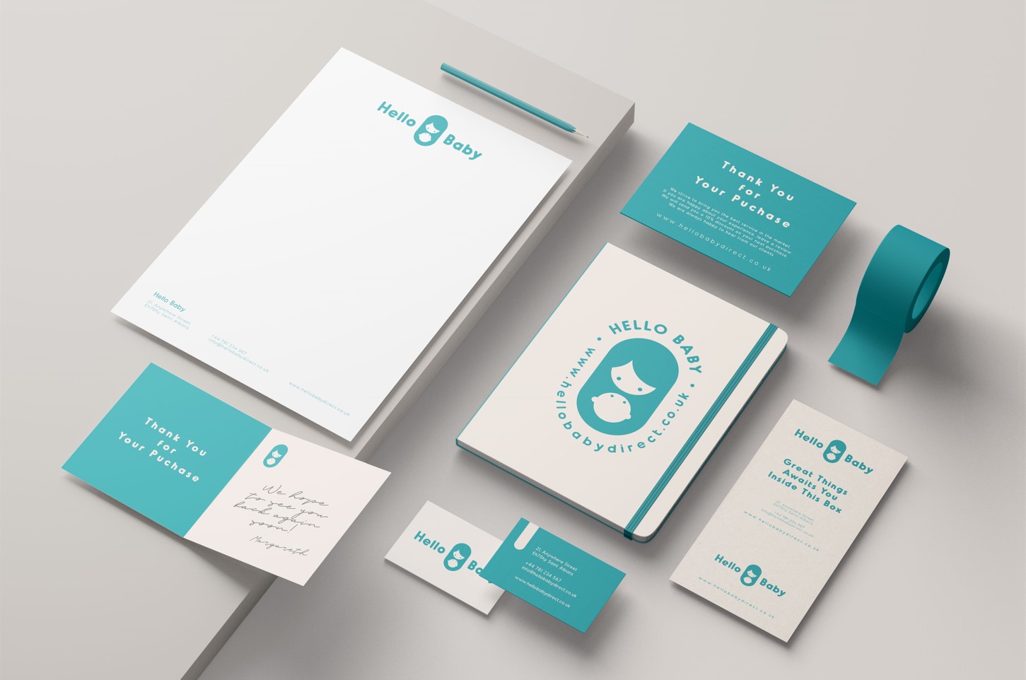
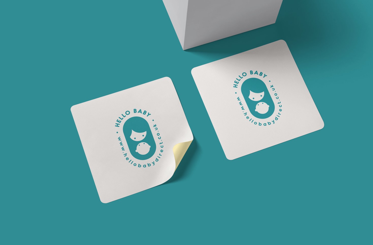
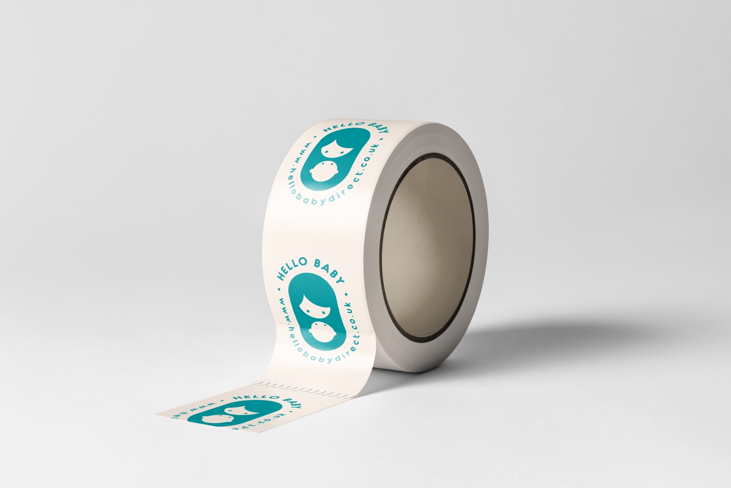
The development of this new brand identity centres around the perspective of mothers, aiming to create an iconic image that embodies the meaning of motherhood through a simple and beautiful symbol. Hello Baby’s new iconic mark is a harmonious symbol depicting a mother and her baby looking at each other. This minimalist image, with a simplified structure, seeks to encapsulate a powerful and meaningful moment of love in a mother-baby’s life.
The primary colour for Hello Baby is Viridian Green. This colour combines the calming properties of blue with the refreshing qualities of green. It represents revitalization, rejuvenation, open communication, and clarity of thought.
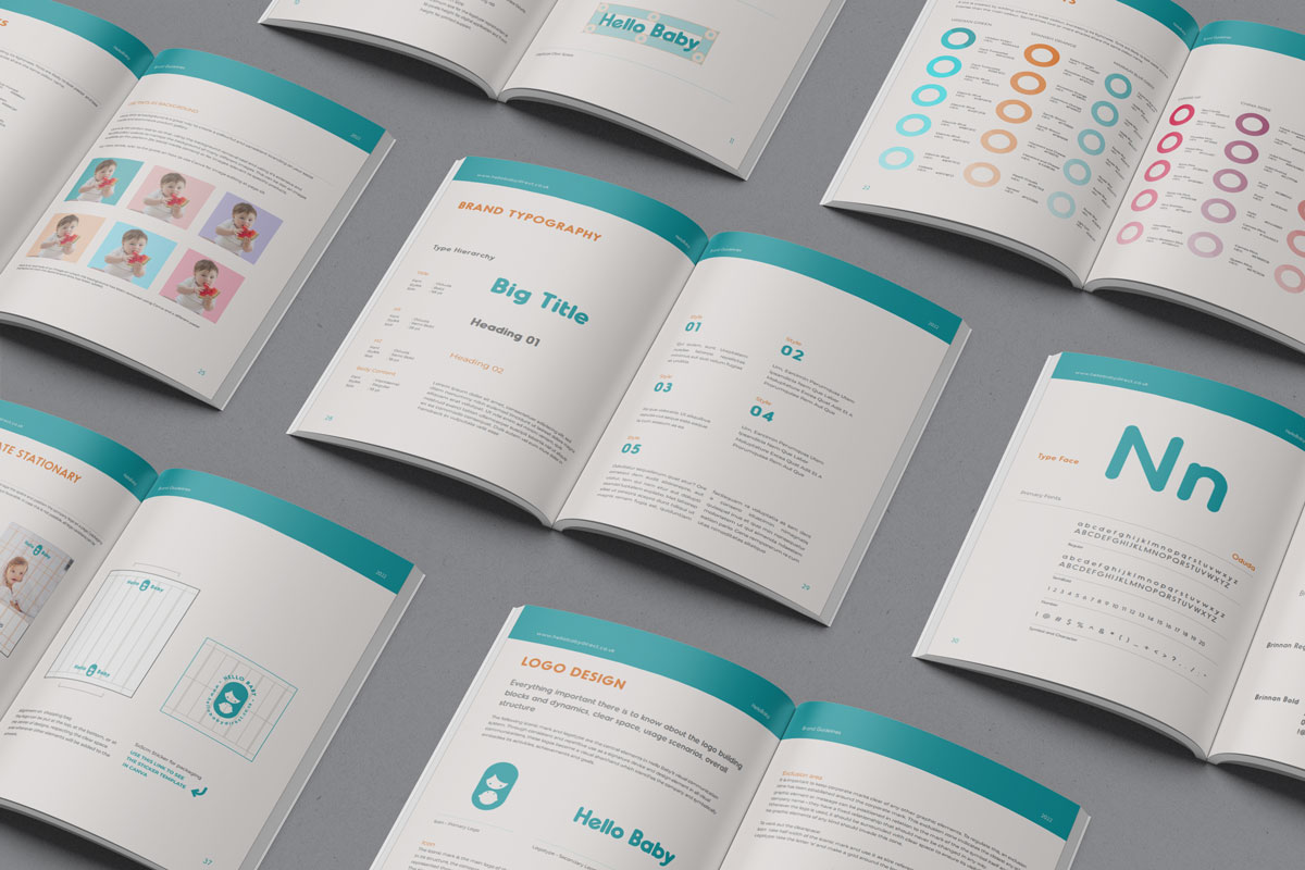
A 52-page brand book has been created to provide an in-depth guide for the best application of the logo and the brand identity.